
How to Read the Reports Dashboard
What is the Reports Dashboard?
The Reports Dashboard is a visual representation of the winery’s sales and their performance compared to previous days, months, and years. These reports are not in real-time and are ready to be reviewed the following morning. The Dashboard is broken up into three main sections.
-Overview
-Monthly
-Daily
Overview
The Overview Report Pulls in Data for your year-to-date sales. To adjust what sales are pulled in please review the setting portion of this document. Below is a breakdown of each category of the report. All aspects of this report that highlight when hovered over can be selected, filtered, and exported to Excel.

Snapshot of Performance up to: This shows you the last date that the winery had any sales that would impact this report. This is also where you can access the settings tab.
Sales year-to-date vs. Previous year-to-date: This shows you the date listed in the Snapshot of Performance up to section and the total sales made year-to-date. It then compares it to what you did last year in the same period. The number displays is how much more or less you have made. If this number is green, then you are doing better than you were last year. The percentage next to it shows you how much of an increase or decrease in revenue there has been.
In the example below this year from January until today, you have made $129,231.71 more dollars than you did last year in that time period.

Wine Club year-to-date vs. Previous year-to-date: This shows you the date listed in Snapshot of Performance up to section and the total active wine club members year-to-date. It then compares it to how many members you had last year in the same period. The number displays how much more or less you have made. If this number is green, then you are doing better than you were last year. The percentage next to it shows you how much of an increase or decrease in revenue there has been.

Sales by Location: This shows you based on the filter you have set up the number of sales per location that qualify. This section is set up as a circular graph. If click on a section of the graph it brings you to a page that breaks down the information by month. It also allows you to export the information to Excel.

Sales by Location Performance: The performance tab, similar to the Sales year-to-date vs. Previous year-to-date, Shows you a comparison to your sales in previous years. The number displays how much more or less you have made. If this number is green, then you are doing better than you were last year. The percentage next to it shows you how much of an increase or decrease in revenue there has been.

Wine Club Membership: This weighted bar graph shows the number of wine club members broken down by Current, New Joins, and switched clubs. If you click on one of the Bar graphs it will pull in the exact number by club per that month.
Sales by Consumer type: This Section has two parts to it. First is the circle graph that breaks down the number of sales by each customer type. However, when you click on the graph it pulls up the total number of sales by each product for that customer class type. On the right-hand side, you can change the filtering to be for specific product types.

Sales by Customer Performance: The performance tab, similar to the Sales year-to-date vs. Previous year-to-date, Shows you a comparison of your sales in previous years by each customer type. The number displays how much more or less you have made. If this number is green, then you are doing better than you were last year. The percentage next to it shows you how much of an increase or decrease in revenue there has been per customer class type.

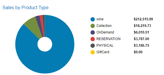
Sales by Products Type: This Section has two parts to it. First is the circle graph that breaks down the number of sales by each product type. However, when you click on the graph it pulls up the total number of sales by each product for that Product type. On the right-hand side, you can change the filtering to be for specific product types and customer class types.
Sales by Month: This shows you based on the filter you have set up the number of sales per month that qualify and compares it to last year's. When reviewing this if you select one of the bar graphs it will refresh the page and direct you to the monthly tab for the selected month.
Monthly
The Monthly Report Pulls in Data for your sales by month. To adjust what sales are pulled in please review the setting portion of this document. Below is a breakdown of each category of the report. All aspects of this report that highlight when hovered over can be selected, filtered, and exported to Excel.
Month: This will default to the current month. However, you can select to view any month within this year and the last.
Sales for Set Month vs Previous Month: This pulls in the current month-to-date sales based on the filters in the settings tab. The number on the right is how much more or less you have made compared to last month's month-to-date revenue. If this number is green, then you are doing better than you were last year. The percentage next to it shows you how much of an increase or decrease in revenue there has been.

POS Trans. For set month vs. Previous month: This pulls in the current month-to-date sales for POS based on the filters in the settings tab. The number on the right is how much more or less you have made compared to last month's month-to-date revenue. If this number is green, then you are doing better than you were last year. The percentage next to it shows you how much of an increase or decrease in revenue there has been.
Active Members vs. Previous Month: It then compares it to how many members you had a month in the same period. The number displays how much more or less you have made. If this number is green, then you are doing better than you were last year. The percentage next to it shows you how much of an increase or decrease in revenue there has been.
Sales Jan 1 to: This section compares your current year-to-date sales. It then compares it to what you did last year in the same period. The number displays is how much more or less you have made. If this number is green, then you are doing better than you were last year. The percentage next to it shows you how much of an increase or decrease in revenue there has been.

POS Trans. Jan 1 to: This section compares your current year-to-date sales from the POS. It then compares it to what you did last year in the same period. The number displays how much more or less you have made. If this number is green, then you are doing better than you were last year. The percentage next to it shows you how much of an increase or decrease in revenue there has been.
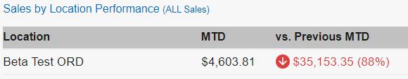
Sales by location: This shows you based on the filter you have set up the number of sales per location that qualify in the selected month. This section is set up a circular graph. If click on a section of the graph it brings you to a page that breaks down the information by month. It also allows you to export the information to Excel.
Sales by Location Performance: The performance tab, similar to the Sales by Location, Shows you a comparison to your sales in previous months. The number displays is how much more or less you have made. If this number is green, then you are doing better than you were last year. The percentage next to it shows you how much of an increase or decrease in revenue there has been.
Sales by Associate: This section breaks down the total sales by each of your associates in the selected time frame. It shows you Sales, Tips, Bottles, and AOV or Average Order Value.

Sales by Customer Type: This Section has two parts to it. First is the circle graph that breaks down the number of sales by each customer type. However, when you click on the graph it pulls up the total number of sales by each product for that customer class type. On the right-hand side, you can change the filtering to be for specific product types.
Sales by Products Type: This Section has two parts to it. First is the circle graph that breaks down the number of sales by each product type. However, when you click on the graph it pulls up the total number of sales by each product for that Product type. On the right-hand side, you can change the filtering to be for specific product types and customer class types.
Sales by Day: This section breaks down your total revenue by each individual day. If you click on one of the bars it will take you to the daily sales report.
Daily
Date: is how you change the day the data is pulled from.

Email Recipients: These are the people who will be receiving the daily email. The emails are pulled from the user’s module.

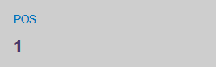
POS: is how many orders have been done on the POS that day.
Settings

Filter Direct-to-Consumer (DTC) by:
All Sales: include all customer classes and products sold.
DTC Wine Sales Only: includes wine product type sold to Wine Club and Consumer class types.
DTC All Products: includes all products sold to Wine Club and Consumer class types.
Wholesale + Distributor: includes all products sold to Wholesale and Distributor class types.
Changes to this filter won't take effect until tomorrow.

Chart Colors can be used to change the colors of the overview, monthly, and daily customer class colors.